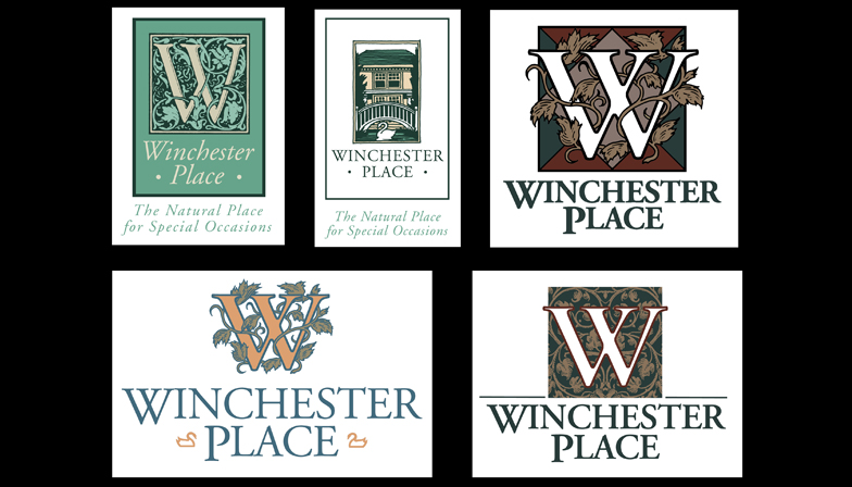
...a logo for a catering / meeting venue.
This had to be the MOST difficult logo I have EVER worked on. The owner wanted it to be simultaneously feminine and masculine, for weddings or for business meetings. To show the swans that the location was known for but to also not show them.
I decided that we ought to make an embellished floral look for the logo and color it with masculine colors, that is what I did and I think it works...then I went home.